Hello!
Yep, we've all been there... had a good idea for a colour combo that you end up really not liking!
I started out with this...
Dina Wakely paints....love these colours but maybe not all together? Not really feeling it at all...maybe black splats and stamping?
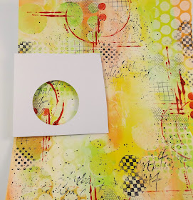
Nope, still not a fan. So, plan B. I punched a circle from card, then used it as a 'frame' to find some bits I DID like....
I drew around the circle, so I could line up the punch exactly where I wanted it....
Rub out the pencil lines, and you have some shapes to play around with!
I made a card....
(And I make cards so rarely I can't get a decently lit picture by the looks of it!)
Doodles around the circles...
And doodles for 'stems'....
I saved the rest of the background to use in other projects!
Have a good Sunday,
Trish xxx


This is so cool. I have a box full of mistakes and off cuts just for this purpose. It's amazing how much better a messy background can look when it's die cut.
ReplyDeleteOh gosh, I wouldn't even like to guesstimate how many of these I have in my "scraps" boxes?
ReplyDeleteYou did a wonderful job of repurposing. The card is so cool & contemporary. Has anyone suggested you design stamps with doodling? Well, I am suggesting. When it comes to adding to my things now, it would seem even doodling is an art form. Yours are great! Tfs. C. :)
I love this idea. It's a master board that you didn't intend to make. Lots of uses for the left overs. Thanks for sharing.
ReplyDeleteGreat idea thanks Trish. The end product looks great with the white background and doodling.
ReplyDeleteThis is such a great idea, like Jaine, I have a box full of mistakes which I am going to try this with! Thanks for the inspiration.. Anne x
ReplyDeleteI couldn't comment on this post when it was published and it seems to be the same with today's post (14/04), the "Comments" button is just not there.
ReplyDeleteI love this idea of taking bits out of a disaster to create something new and beautiful, the card is gorgeous!
Very nice idea, Trish! Thank you very much for sharing!xxx
ReplyDeletegreat idea to save it!
ReplyDeletegreat idea! Thanks for sharing!
ReplyDeleteI love this! The card reminds me of Tracy Verdugo's paintings. Part of her process is to paint an underlayer of all kinds of things and then she selects and paints around things she loves, completely changing the look through multiple layers. I will also need to dig through my pile of unfinisheds and see what I can do with them! I do love your process but the finished page seems to need a focus. Taking all of those little spots that seem complete is perfect!
ReplyDelete