10 December 2015

The 12 Designers Of Christmas - Designer #5 Trish Latimer

Hello!
So.. where were we? oh yes, Inktense pencils!
Yesterday I went on a bit about these, letting you all know just how much I like them!
I thought I would give you a little 'how to' on the shades of Inktense I used to colour the face on the whimsy girl in today's project.... but first, here she is in her finished state!


 My usual skin tones are a bit paler and more 'burn the second you see the sun' , but I really like changing things up sometimes! So.... lets begin!
Obviously we need to sketch out our girl first! As we're using watersoluble pencils, we will be using water.... :) So, you will need to work on watercolour paper or card.  As there are so many brands out there, I would recommend trying a few to see which you like best? My 'big' tip is to work on HOT press paper, as it's smoother than cold press. Unless you want a more textured look, of course!


The first colour used is baked earth...


As you can see, I coloured a line all around the edge of the face, adding a little extra around the cheekbones and above the eye sockets. Next, take a waterbrush or wet paintbrush, and go over the whole face, moving the colour released once the pencil is wet into the centre...


The idea is that the most intense colour is around the edges, getting paler towards the middle around the nose and between the eyes. I dry this off with a heat gun before going in with the next colour.
Which is...... Willow.


A darker shade, do the same as you did with the baked earth, but less of it! Again, use the waterbrush to dissolve the pigment and blend it..


This looks quite dark, once the hair in in place the dark shadow around the hairline will make more sense!
The third colour is Fuschia. It looks a bit dark when you draw it on...


But it will be very pink once the water is added! Use a little under the eyes/on the top of the cheekbones, and a little more over the outside edge of the eyes. Blend using your waterbrush, make sure there are no harsh pink lines anywhere!


The next addition seems to bring the whole thing together...


A touch of white in a rough triangular shape works wonders! Start at the tip of the nose, and work upwards and outwards to a wider area on the forehead...


Eyes next... I chose blue. Draw a thick line around the pupil...


The water will spread the colour throughout the iris, giving a shaded effect...


You may notice I've also added a dot of pink in the corners of the eyes too! The lips were coloured with red pencil, then I used a couple of 'non Inktense' products! Black fineliner pen for the pupils, and to outline the top of each eye, and a white paint pen to add in the tiny highlight dots...


 She still looks a bit odd with no hair as the shading doesn't really work.... it looks better when hair is coloured in!


The background was kept very simple, just a wash of blue and some music paper stars..
Her dress was red pencil, with white dots...


Fingers crossed that was a little bit helpful?! 
Don't forget, to be in with a chance at winning the mixed media bundle up for grabs, you need to leave a comment on the posts of all 12 designers during this whole extravaganza! I'm designer number 5... so go back and add any you may have missed!
We will be back tomorrow with another spotlight on an exciting brand!
Have a great day,
Trish xxxxx


09 December 2015

The 12 Brands Of Christmas - Brand #5 Derwent Inktense Pencils

 Derwent Inktense Pencils


Derwent Inktense Pencils are as versatile as watercolour pencils, but with a firmer texture that allows them to perform with the brilliant intensity of traditional pen-and-ink. These pencils are available in strong, vibrant colours which work beautifully on their own or can be mixed together to create rich, subtle tones. The pure, clean colours are perfect for bold expressive drawings, but can be used with plenty of water for a much more subtle look!
Inktense pencils can be used dry for rich, intense colour or washed out with a little water to create a vivid translucent effect. Once dry, the colour is permanent and can be worked over with other media.

Personally, I love Inktense! The colours are just so vibrant, it's hard to believe the intense (yup, see what they did there with the name!) colour has come from a pencil. It could just as easily be an ink wash!
Here is a little video...


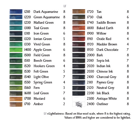
There are 72 gorgeous colours in the range...


Derwent Inktense Pencils can be found in the ASOI shop HERE!

Now.... you may notice that there are no flesh tones in the range..... So, how can you create faces? (OK, that was my first question, it might not have been yours!)
The simple answer is to experiment.... and tomorrow I'll show you a brand new whimsy girl created entirely with Inktense colouring! Here is a little peek...


Don't forget... you need to leave a comment on all 12 designers posts to be in with a chance to win the mixed media bundle! We've had Jaine, Vicki, Clare and Georgie so far.... did you leave them some love? You can always go back if you've missed one lol!
See you all tomorrow!
Trish xx


08 December 2015

The 12 Designers Of Christmas - Designer #4 Georgie Connelly


Hi Folks,

Georgie here, and today I am following on from yesterday's post.

The mediums I have used in this project were mentioned yesterday in some form or another.

Following the Christmas theme I have created a sparkly star mixed media tag. I love stars, and a perfect excuse to really get sparkly!!


Along with the mediums, I love the Prima embellishments. Their collection is vast and there is something to suit everyone, but for me the metal street signs and roads signs are up there at the top as they create the most striking focal point and draw the eye in immediately to one area.


Next up to the embellishments, is their crystal line, Say It In Crystals. They always produce well coordinated, gorgeously faceted crystals. I love the ones I have used in this tag, not sure if that have a certain name for this style but I love the detail, all those little sparkly lumps and bumps of extra goodness. Also photographed here is a Star Brad by Finnabair, (I used a few in this project) such a fab set of different sizes and colours, plus you get a good amount in the pack, so great value for money!! 


Can you see the shimmer? :) Isn't it lovely?! The gold texture is a mixture of 3D Gloss Gel and Gold Mica Powder, which was then spread using a palette knife. Then I varied the Art Basics Black and White Gesso, so the edges were darker and the line of travel of the star was brighter. Before any of this, I used my fave of the sand pastes, Art Extravagance Black Sand Texture Paste


So, as someone not being a fan of glitter, you can see that I have done a complete u-eee at some point over the last year :) I adore this chunky stuff (Art Ingredients Glass Glitter). As texture is quite an important aspect for me this helps to add an extra dimension as well as that famous Finnabar-style sparkle.


Of course, finishing up with some Prima Jute, which will also be used to wrap around and match the parcel to the tag. Probably go for plain kraft paper as a choice of wrap colour to allow the tag to pop against the background.


That's it from me for today, hope you enjoyed my review from yesterday and today's matching post.
See ya laters
Gee
xx

07 December 2015

The 12 Brands Of Christmas - Brand #4 Prima

O.M.Goodness!! Where do I start? Well most of you that follow me know that I just adore Prima and all their goodies, but earlier this year Finnabair brought out a line of mediums as well as other brilliant extras, and boy, as a fan of mixed media I was just in heaven!! So, for this review I will focus mainly on those products. I have gone for a bulleted list as I figure that is easier to digest as otherwise there would be a lot to take in, so without further ado, here we go:


A staple for anyone getting into mixed media. Both the black and the white are just perfect, they provide excellent tooth for the paint to grab. They are heavier so can be used to help add texture too, but can be watered down for thinner coverage or 'knocking back'. Both are great for splatters too :)

  • Art Extravagance Crackle

I have the White and Copper ones and it does exactly what it says on the tin! It provides some of the best crackle out there and I have a few other brands of crackle!! I would never trade this for another! I have found that allowing crackles to dry naturally produces the best bigger crackle effect, whilst heat tooling creates ‘fine china’ style crackle.


What is more perfect for adding texture?!! The sand is great, and little tip, the black is the thickest, chunkiest of all the sands (perfect for us texture lovers) and is held in a gloss like gel. So, handy to get a cover of gesso over if you want to add colour after. I have found this kind of texture allows some of the most spell binding flow of colour movement in amongst the particles, especially if using powders and sprays to push it around.


My goodness, this stuff has so many wonderful properties... I love both the versions, 3D and Soft Matte. The 3D, is great for running through a stencil and creating that bumpy resist. You can also add powders to these and the colours just GLOW, mix with some glitter too and you have some truly spectacular effects! The gels also act as a perfect adhesive, the Soft Matte for thinner papers, cardstock and the 3D for chunky heavy embellishments.


Out of the two pastes I have, modelling and light, I can’t say I have noticed a huge difference, but what I have found is they are perfect for stencils or creating that rough background look. Unlike other pastes, they are very unlucky to bleed through under a stencil, only time I have known this is if you add more liquid but you would need to add a lot. Colours mix beautifully in them as well as the other fantabulous extras in the Finnabar line, like Glass Beads, Micro Beads and Glass Glitter. The other thing about the pastes is that once dried they with take colour well that is applied to them.


Now, where do I start with these… I own most of them (yeah I have glitter addiction issues). I use them in my projects but probably most of the time I am just staring at them, stroking the pots and afraid to use up their sparkly goodness -anyone else as crazy??? :) I do honestly love these, the chunky glitter is just magical and can be put into any media with great effect. The colour range is amazing, but what I would say is, and not necessarily a negative point, but some of the colours will bleed into the medium. I noticed this with the Violet, but the awesome looking pinky coloured gel looked super cool!


These awesome boxes filled with a sparkling promise of hope just call to you... or they do to me. Like the Glass Glitters, I just stare at them and hesitate to open the box for spoiling the mesmerising trance they put me into lol. Again they they can be put into the pastes and gels, but my favourite method is to apply the 3D gel through a stencil and then sprinkle on top. This creates the most sparkle in a very organised pattern :) Just tap off the excess after the gel is dry, but with this method allow yourself some time, as air drying is best.


Prefer the delicate touch of sparkle? This works in the same way as the other two glitters but is far more subtle but just as magical. 


When a project is close to being finished these little touches can just help take your work that step further! Again, a great choice of colours with recent new releases. For me, I love adding to the centre of flowers, mixed media clusters or for helping to add a little extra texture on the top of piece. Works like the others with the pastes and gels


Now, this is something very special! The shimmer is just jaw-dropping, out of this world, crazy good! The colours are awesome and appear to only be growing in the range and they are designed to be used in amongst the above mentioned gels and pastes. The pastes will knock them back a little in the sense on making them paler and the gels really make them pop! I love how versatile they are and how you can create some lovely random effects (sprinkle powder on a project and just mist) to detailed colouring (water brush has worked best for me here). The shimmer these have really do not detract from the intensity of the colour and once dry on your project create that sense of magic, which obviously, Finnabar is famous for in her work!


And I have a confession... I never used to be one who was into glitters and shimmers or anything that was remotely sparkly - I bet that sounds surprising after reading the above huh?!! But I have done a complete 180 over the last year and seeing the gorgeous work of those I follow really inspired me to try. Now I’m totally converted, and using glitter with mediums is what really changed my view, as it enabled almost total control and to be able to use it in many different ways.

Hope you have enjoyed today’s product review, do let me know if you have any questions on the above and I will be happy to answer them.

Hugs
Georgie


06 December 2015

The 12 Designers Of Christmas - Designer # 3 Clare Messenger and Let it snow!

Hello all, it's Clare here today bringing you a bit of christmas bling! Now some of you may curse me asking for snow but it seems that ever since my mum embellished us with sledges one christmas, we have had none. Living on the South West coast of England the white fluffy stuff just flows over us and we are left with a mere smattering.
So to encourage a seasonal flurry here is a litle wintery project I put together.
For this project I used:
Distress crackle paint rock candy

With this project I added the texture with a stencil after that was dry I assembled the Prima wood icons in a box and chosen artifacts with a hot glue gun. Then I gave everything a coat of black gesso. Once dried I dry brushed over my blackened project using Dina Wakely paints. I gave my wintery project a coat of distress crackle paint and once again waited for it to dry.
Out with the glue gun again but this time to add in some dots which will soon become beautiful pearls once I dust over with Finnibair art ingedients mica powders.

Thank you for stopping by today.

With lots of christmas crafty hugs,
Clare x x x

 By leaving a comment on all twelve of the designer blogs you could win yourself a fabulous prize of a mixed media kit so you don't want to miss out.

05 December 2015

The 12 Brands of Christmas - Brand #3 Tim Holtz Layering Stencils

Hello fellow bloggers. I was very excited when asked to write a review for a product but I was soon struck with the thought 'what shall I review?' There are so many gorgeous crafting products available and I am extremely lucky to own some of them so I had a little think about what I enjoy using whilst I craft and I have to say that more often than not I end up rifling through my stencil folder.
This year I discovered Tim Holtz Layering stencils and I have managed to acumlate a small selection. These stencils are so verstatile. There is a growing collection available with lots of designs for a variety of occasions and oodles of techniques and mediums to use alongside.

Here are a few projects using these delicious stencils in a variety of different ways.

For this card I spritzed my Tim Holtz Distress spray through the Burlap and Cargo stencil. I blended some Distress inks around the edge and then sprayed water with my mini mister through the Measured layering stencil. To create a border I blended black soot distress ink through the Splotches stencil. The stamp set used for this project is Warehouse District.
This card has seen my fingers pink for a number of days now. A messy technique but lots of fun. I applied various shades of Distress inks to the Lace layering stencil, spritzed with water and brayered onto some watercolour paper. To keep the theme, on the background I dabbed my versamark pad through the same stencil and heat embossed with embossing powder. I used the Finnabair Dont forget to fly stamp over my inky background.

I love adding texture to cards and canvases and these stencils really do the job. The Woodgrain layering stencil made a fabulous bough for Robin to perch. In the background I used the Splotches stencil once again but this time for a bauble effect. I used one of Dina Wakelys Scribbly birds for the robin.
Remember to check out the remaining Brands of Christmas for this month. Also running is the 12 Designers of Christmas, if you comment on all 12 of these blog posts you could be in with a chance of a fabulous mixed media prize!

Crafty christmas hugs to you all,
Clare x x x

04 December 2015

12 Designers of Christmas -Designer # 2 Vicki Abrathat

hello there! 

This is a rare sight from me....  making my own Christmas cards, 
but with some many fabulous products in the shop
 it was difficult not to do some for close friends and family.

Keeping it simple and clean is the way forward for me.  

I have utterly fallen in love with these 
stitched snowflake dies from Lawn Fawn .    


The cards and the die cuts have all been made from my absolute favourite 
Its a really nice warm white and cuts beautifully. 


Merry & Joy (as shown below) are Hero Arts dies from their Stamp & Cut range, so you can add additional messages to your cards if you want to.  

To create the raised effect I have adhered 4 dies cuts together using Claudine Hellmuth matte multi medium. I keep a stash of the small bottles in my drawer.   I find this the best "glue" to do this. If there is any spillage I run round the edge a QuickStick Tool - it comes with a fab pointy-stick-thing 
(I know...very technical!) 


The raised panels are Lawn Fawn Stitch Squares, the tops ones are back with regular craft foam so they don't get squashed in the mail. 

I also have a bunch of snowflakes left over... they may well become table confetti.  

 By leaving a comment on all twelve of the designer blogs you could win yourself a fabulous prize of a mixed media kit so you don't want to miss out.