28 February 2013

Embossing workshop part 4 - Throwing everything at it.

It's the fourth and final workshop in my embossing mini series and on my journal page I've managed to creep in more than one technique so you're getting more for your money so to speak!


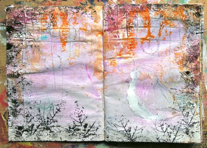
My background started out with a layer of paste through a Crafters Workshop stencil, acrylic was painted over that in turquoise and green with a print from one of the ephemera packs glued on with gel medium. 

I wanted to create a resist with my UTEE so I used a stippling brush to add the perfect medium through a Prima stencil.

 
I added the UTEE and melted the powder. 


On the other side of the page I used my clear ink pad to swipe over the raised portion of my texture and added powder. My ink pad skimmed over the surface so I was able to just add powder to the very tops of my texture adding to it further.


I then swiped over the entire page with a Distress stain in Wild Honey which stained most of the page but left where I'd added the embossing powder. The effect reminded me a bit of a grungy wall.


Here I also cut a star using a Sizzix die then dry embossed it. I wiped my ink pad over the top to catch the raised areas and heat embossed again. I stained it with the Distress stain wiping off the excess from the embossing.
 
 
Here's a closer look at all of the embossing together. The title was cut from a magazine and the border top and bottom was cut from Glitz Design Yours Truly Ephemera.
 
 
I  hope you enjoyed my mini series and it's inspired you to try some embossing of your own.

See you soon

Jaine x
 

27 February 2013

I brought you a heart....

Hello!
I've made a messy painty panel to share today, lots of pics to show you how I created it, so pull up a chair and get comfy!
The base I used is a Tando chipboard panel..... These panels start off grey, so need a good coat of white paint as a base. That way the colours you will be putting on top will be nice and bright! The other great thing about applying a white base is you can put a nice thick layer on, heat it rather a lot and it will bubble up nicely, giving some rather lovely texture....
I added some tissue wrap paper in a strip across the bottom. As I'm going to add a figure to the panel, I need to put something for her to stand on. I wanted to add it now so it blends in with the background. I used a glue stick to attach the tissue, and purposely wrinkled it to give even more texture. The whole panel was coloured with Citrus, Pool and Purple Twilight Adirondack Paint Dabbers...
Some detail background stamping comes next...
And now the fun part, and the technique I wanted to share today. Printing with household 'junk' !!
I'm using red paint for all the printing, my favourite red which is a Claudine Hellmuth colour!
It's perfectly OK to raid the kids Lego....
The wheels make fabulous marks...
Good old bottle top printing....
Try and collect tops of all sizes, smaller pen lids are great!
Old store cards for the lines....
Make sure you dry all the paint well before the next bit, adding dots and doodles. You may think you can be careful, but I've lost count of the times my hand has rested on a bit of wet paint and smeared it. The thicker printed lines will also bubble up when you heat them, if you're lucky! OK... dots and doodles added...
My Stampotique figure was stamped onto white card and cut out, with a smidge of colour added to the heart...

I created the phrase with my new favourite toy.... look what I found....!

(well, I say *found*, to be totally accurate it was more a case of  'look what I bought from Ebay' !!!)
It's a bit smelly, probably been in a garden shed for years, but a quick change of ribbon and it was good to go. Love it! Sorry, I'm wandering away from the point here.......
So, glued the typed phrase on to the background..
Lots of stamped and printed details...
And nice wrinkled texture from the tissue....
I hope you like it!
See you soon,
Love Trish xxx


25 February 2013

Stargazer

Hello!

Todays project was a challenge for me. I wanted to use some products which I didn't use before, especially Prima Wood Doors. Unfortunately for last few days I've been listening very inspiring album and work flowed smoothly.


For a background I used a piece of cardboard. I glued pieces of newspaper, paper from Graphic45 Bird Song Collection and Glitz Design Paper Layers – Happy Travels. Than I painted them and once again glued few more pieces. I added Jenni Bowlin Die-cut & Perforated – Receipt Kraft and once again used some paints and Dylusions Ink Spray – Postbox Red.

The hardest part of my project – I painted a face on Claudine Hellmuth Sticky -Back Canvas and stick it to the background. Than I glued Prima Wood Doors.


I think you know this from my other posts, I love adding recyclable wastes to my projects ;) This time I glued a package from Prima Bulb which I used few posts ago. Inside the plastic package you can see stars from Jenni Bowlin Grey Skinny Alphas. I also added letters to my project from the same alphabet.  

I needed more texture that's why I stamped some of Stampotique stamps using Archival Ink Jet Black. The last touches – I added two colours of Ranger Liquid Pearls.

Magda x

24 February 2013

Made in minutes!

This time I'm sharing a quick way to make a layout. I love messing around with mists and paints on my pages but sometimes the simple touch is the best;-)

I made this page in about 30 minutes watching tv:-)

First I picked out my papers. If you choose a b & w photo anything goes;-) I don't really mesure but just cut the papers up randomly. The first is the backside of  "Red Flower" from the Now & then papers from Teresa Collins. Then I curled up a piece of Glitz Designs Yours Truly Ephemera and a French Kiss paper Layer also from Glitz. When you curl them like this it gives the page some extra depht. I attached them all using staples to be even more quick:-)

In between the layers I put a few journaling cards. The tag in the back is from Jenni Bowlin and it is matching perfectly to the Alpha stickers also from Jenni Bowlin. I embellished the page with a Donna Downey Poppy flower from Prima and a Light bulb from Prima junkyard findings, some twine and some metal flowers.

To give the page the final touch I wrote some journaling along the edge.


Thanks for looking:-)

22 February 2013

Circus Circus!!

Hello!
Normally, I have a theme or idea worked out BEFORE I start creating, with this one, the theme kind of crept up on me afterwards!! I wanted to go bold and bonkers with colour....so I did!
This is a chunky wooden ATC, fabulous dinky size, but still plenty of space to get to grips with!
I started off by giving the wood a thick coat of white paint, then heat drying. This causes the paint to bubble up, so you have texture as well as a white base to add the colour to. This pic shows the bumpy texture nicely...
All the colour on this piece was created using Acrylic and Indian inks, mainly from the Bombay Ink range, with a couple of the Daler Rowney pearlescent colours in there too! I very simply dripped the inks down the sides of the block, drying in between colours so no muddying occurred. The edges were given the same treatment..
I also added 'bubbles' of colour to the stripes to break up the harsh lines a little. White paint was then added in the form of printed circles and lines, again to break up the stripes, and I did a little doodling with a white pen. It was at this point that I started to be reminded of a Big Top, lots of bright Circus colour. This tied in nicely with the embellishment I had planned for the top, a die cut flower, again coloured with lots of ink bubbles...
Reminded me of a big joke flower in a clowns buttonhole! This one doesn't squirt water though, it has a little stack of buttons in the centre to add a little height...
Easily created, and very effective, simply glue buttons together, give them a coat of white paint then colour with the inks. I created feet for my block in the same way..
My stamped image (Jenni Bowlin) of a playful child seems to fit my theme too...love this image, I hope there will be more in this style from her! A small word snipped from chit chat stickers completes my ATC, a bit bright, but very cheerful!
Love Trish xx


21 February 2013

Embossing workshop part 3. Embellishing the embellishments.


I'm back with part three of my embossing workshop and as promised I'm back to using the melty stuff. I'm using the UTEE again with a little technique which also uses Perfect Pearls and chipboard shapes. I love this technique which is perfect for using with UTEE and chipboard.  UTEE stands up to longer heating time and chipboard stands up to a lot of layers. So let's get going...
 
I'm using a puzzle piece to work on for my demo but in the shop you'll find chipboard sheets or grungeboard which is great for cutting your own shapes.  I chose two colours of Adirondack die ink and after painting my chipboard with gesso, I coloured the base with my ink.

 
With the ink wet, cover with a layer of UTEE and melt.

 
Go back over the chipboard piece with a clear ink pad or Perfect Medium then dot on some Perfect Pearls. You don't need to cover the piece entirely just random spots of pearl powder.

 
Next comes the delicate bit. Cover with more UTEE being quite generous with it. As there isn't any ink to hold the powder in place, hold the heat gun high up at first so as not to blow the powder away, then move in closer when you see the first beads appear.

 
Keep heating even when it's melted and you'll see the Perfect Pearls move or float about underneath. 

 
The effect is a bit like that of expensive Dichroic glass which has coloured bits inside it.  It's so cool. 

 
Here I did the same thing again but using different colours of Perfect Pearls.

 
While the top layer of UTEE was still molten I gently pushed this mini bulb into it. You could try adding beads or sequins too. 

Here I covered the whole tag in UTEE and PP and after adding the top layer I put the whole thing in the freezer for a few minutes. After I'd taken it out I could easily crack it by bending the card.  If you end up with too many cracks just re-heat it and start again.
 
To finish my piece I used a Ranger Kraft tag, gesso,  Dr Martins Bombay ink in yellow, a little off cut of Glitz Design Yours Truly Polka paper,  Perfect Pearls in gold, forever blue, forever red, perfect pearl, copper and rust, Jenni Bowlin alphas and a Prima typo bulb.
 
Next week is part four and my final workshop in this series. So don't forget to come back.
 
Jaine x

20 February 2013

Tag-time!

I just love playing with different techniques and colors on tags:-) This time I have a bright and yellow one wich is perfect now as I'm longing for spring:-)

First I've used a stencil from the Crafter's workshop and made stars using molding paste. Then I've sprayed with Dylusions, mainly yellow but also added a touch of blue. I also like spraing som water on top to blend the colors together.

Then I've embellished with a piece of Glitz Designs Yours truly ephemera patterened paper, a ticket, a journaling spot, washi tapes and some stamps. To give the tag a little special touch I added a Prima Art tile and some Prima crystals.

So here it is for you - hope it'll brighten up your day:-)


18 February 2013

Experimenting with colours


Hello everyone!

Today I would like to show you how I've made a few pages for my art journal. I love experimenting with colours, I've always liked! First with pencils now with different mediums.

Do you remember my post with Jasio? I used the same journal made with brown envelopes.
First I put some gesso, I wanted a thick layer but also not very thin because I wanted to stamp circles - I used a tap of ink spray - and some lines using the other side of a thin brush. You can try different ordinary objects like a bubble foil, a bank card ( the old one! ;)) and many many more.


When gesso was still wet I sprayed a pink mist and added some purples - Tattered Angels Glimmer Glaze and Tattered Angels Glimmer Glam in few places.


The next step, I added a black paint around the pages. I allowed it to dry.


I wanted some more texture, I used a Stampotique stamp.


I draw a bird and leaves using Derwent Inktense and coloured using paint and a few drops of Tattered Angels Glimmer Glaze. I cut a crown from Glitz Design Truly Chevron paper and using a brush I sprayed a black paint.


Last step – I added some text.
I've done two pages, one with bird and second with house. I used the same products.


Magda x