Showing posts with label Indian Inks. Show all posts

12 May 2014

Find Joy In The Ordinary...

Hello!
A simple painty panel from me today, this is a result of a little experiment!
I wanted to see if I could dye crackle paste....
Turns out, you can!
I created a quick and easy smeared paint background on a Tando panel, using blue, yellow and white paint. A little white paint stencilling through some sequin waste..
I then put a little crackle medium in a foil dish, and added some Bombay Ink. Mixed it together, then applied it through a circle stencil...
I found the colour intensity varied depending on the thickness of the paste, but I really like that effect, as well as the crackle! I did a little doodling, both around the circles, and around the edge of the panel..
Rub On words to finish.....
Another successful messy experiment!
Trish xxx


29 November 2013

A Time of Wonder.....

Hello!
I have a little bright and cheerful Christmas scene to share today....
An alternative Christmas colour scheme, one of my favourite combos of purple and turquoise!
The back and base of my scene are Tando chipboard panels. The back is full size, the base I have chopped up, its probably about half the size of the back. I covered them with gesso, then used acrylic drawing ink as my colour. Simply dripped onto a craft sheet and applied with a sponge. White brayered layers, more ink, stamping and some clear gesso stencilled stars in there too!
My final snowy touch is my go-to Christmas technique, melting white UTEE to give the snow splatter look!
My tree is also coloured with acrylic drawing ink. Top tip whilst doing this is to spray with water first, then the ink disperses so much better! This IS really messy, but the huge plus point is that acrylic ink comes off your hands easily with a little scrubbing. If I had done this with dye inks my hands would have been bright purple for days!
I gently sponged a little Glossy Accents over the ends of the branches, and added some Peacock Feathers distress glitter over the top for a cool contrasting look!
The base was coloured in exactly the same way as the back. I joined the two together, then glued down the tree. I added my Rub On phrase to some white card, then cut it out and used it banner style by the tree...
I feel more purple trees coming on...really love that colour!!!
Trish xx


02 September 2013

We should dance!

Hello!

Recently I was experimenting with a technique which I had shown you last time. It was a great fun and the best is...more to come! Today I have for you a quick art journal page.

As always I used a lot of different mediums for my background. Background is a mix of mists, Glimmer Glaze and inks including Ph Dr Martin's Bombay Indian Ink. I also put some modelling paste for a first layer.


I stamped Stampotique Originals stamps from a new release and Glitz Roller Doodle using Ranger Archival Ink.


 I drew blue spots using Posca Paint Pen. For last touches I used Sakura Pigma Micron Pen and black gesso.


Magda x

22 June 2013

Listen To Your Heart...

(or....another way to use indian inks!)

Hello!
I've been playing with Indian Inks again, another one of those 'old school' techniques. In fact, I'd go as far as to say this is literally an old school technique, as I used to do this with paint when I was about 5 years old at school!!!
I made this panel.....
(This is also about the closest I will ever get to clean and simple.....and I'm still covered in ink!!)
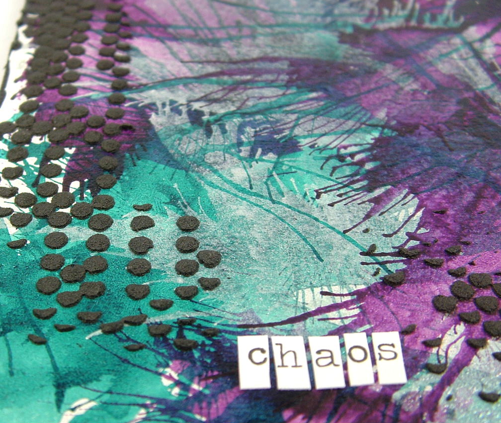
The heart shape has been cut out from an inky background, a background that is both loads of fun and a total doddle to do!
You need to get two pieces of glossy cardstock (has to be glossy, regular cardstock just absorbs the ink and you don't get the smooshy movement). Drip a few drops of ink onto one piece of card, then place the other piece over the top, glossy side to glossy side. Squish the card with your fingertips, then peel back. You'll have two pieces of multi coloured, vibrant backgrounds! I made lots....
You need to experiment with colour combos and the amount of ink you use....as you can see some of my pieces ended up a little muddy! You can use a whole sheet for a very surreal other-worldly look, or you can choose to use just a small portion, as I did!
I swiped some of the same coloured ink across my plain white panel, then added a piece of washi tape. I attached a strip of card I had die cut, and lightly glued down the heart on top...
I then got the sewing machine out, and added a border, and fastened the heart down with stitching...
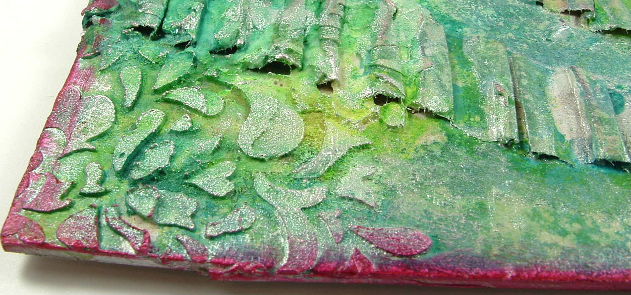
After all this was done, I wanted to tone down the vibrant colours, and add a little grungy-ness! This was done very simply by gently brayering with white paint. I waited until this point to do this as I knew I wanted to take the harsh black-ness away from the stitching too!
The only crisp black colour comes in the form of my rub on words....
Lots of white space from me today, not my usual way of doing things, but I think I like it!!
Love Trish xxxx


02 June 2013

Chaos!

Hello!
I've been playing with inks again! A little inky panel......
I used a small Tando chipboard square, and gave it a good coat of white gesso first. As well as creating a white background, the gesso also has the effect of coating the chipboard, so the ink doesn't get absorbed straight away. This coating means the ink stays wetter a lot longer, vital when I wanted it to move around!
The technique I used is very simple indeed, put a big drip of ink onto the panel, then blast it with compressed air! Really easy to get hold of, cans of compressed air are used for things like blasting crumbs and other gunk from your keyboard!
The effect you get is fab....

This is done with just three colours of  Acrylic ink, a turquoise, purple and silver pearl. I dried each colour before adding the next on top. This stops the colours mixing, which I didn't want in this case, although having the colours mix together is a cool look too!
I then used black gesso through a stencil to give a little more detail around the sides....
The word was cut from chit chat stickers, and the little lady looking bemused at all the colour chaos is from Stampotique...
Have a nice weekend everyone!
love Trish xxxx


08 May 2013

Follow Your Heart

Hello!
Yep, me again!
Today I want to share an inky panel (yes inky...only a smidge of paint was used in the making of this piece!!)
I wanted to create loads and loads of texture, so I glued down various 'bits' onto an 8" square chipboard panel before I started in with the colour. Corrugated card...
A cardstock stencil (Jenni Bowlin)
Along with a bit of old book page here and there. I scraped texture medium through a stencil too...

Once all the background bits were on and dry, I lightly sponged with gesso to give me an all white base to add the colour to. I used a mixture of Bombay Inks and Daler-Rowneys for this, two shades of green to begin with. I sprayed a little water and blotted some inks away to give the mottled effect. Once the greens were dry I went in with the most fabulous ink, silver pearl by Daler Rowney. All the silver effects you can see are that ink! You only need a little for the translucent shimmer, but then you can build up layers for a more opaque silver look. I haven't used this in an age, and can't fathom out why! Love it.
Anyway, I felt the greeny silver look needed a little more colour, so went for a bright red 'halo' circle!
Now this IS paint! Dash of Red by Claudine Hellmuth. This paint is versatile too...the edging is the same shade, just a thin layer so the colour is a more muted almost dark pink. I covered the cardstock with three layers of the paint to give the depth of red I wanted before stamping the text and punching out the circle. The Stampotique figure (Mela- possibly my favourite Stampotique) was then placed in front of her halo..
A Remnant Rub on phrase finished off the panel...
This is definitely one of those 'note to self' pieces, in this case use more inks!!!!
Hope you like it,
See you soon
Love Trish xx


22 February 2013

Circus Circus!!

Hello!
Normally, I have a theme or idea worked out BEFORE I start creating, with this one, the theme kind of crept up on me afterwards!! I wanted to go bold and bonkers with colour....so I did!
This is a chunky wooden ATC, fabulous dinky size, but still plenty of space to get to grips with!
I started off by giving the wood a thick coat of white paint, then heat drying. This causes the paint to bubble up, so you have texture as well as a white base to add the colour to. This pic shows the bumpy texture nicely...
All the colour on this piece was created using Acrylic and Indian inks, mainly from the Bombay Ink range, with a couple of the Daler Rowney pearlescent colours in there too! I very simply dripped the inks down the sides of the block, drying in between colours so no muddying occurred. The edges were given the same treatment..
I also added 'bubbles' of colour to the stripes to break up the harsh lines a little. White paint was then added in the form of printed circles and lines, again to break up the stripes, and I did a little doodling with a white pen. It was at this point that I started to be reminded of a Big Top, lots of bright Circus colour. This tied in nicely with the embellishment I had planned for the top, a die cut flower, again coloured with lots of ink bubbles...
Reminded me of a big joke flower in a clowns buttonhole! This one doesn't squirt water though, it has a little stack of buttons in the centre to add a little height...
Easily created, and very effective, simply glue buttons together, give them a coat of white paint then colour with the inks. I created feet for my block in the same way..
My stamped image (Jenni Bowlin) of a playful child seems to fit my theme too...love this image, I hope there will be more in this style from her! A small word snipped from chit chat stickers completes my ATC, a bit bright, but very cheerful!
Love Trish xx


27 January 2013

You + Me = Us

Hi there, it's Arnlaug with you today:-)

A quick post today to share a way of dressing up this great Kraft Classine Envelope from Tim Holtz.
I've never tried this product before and must say I love it! It's got a great look and quality and I'm sure you can find many ways of using it.


For my envelope I started out culing it a bit before gluing some cheese cloth down using multimedium and gesso. Then I dropped some turquoise Bombay Indian Ink and some Orange Crush Glimmer Glaze. I just love the two colours together!

I embellished my envelope using some Glitz Design Whatnots from the Yours truly collection. I also added some Prima Say it in Crystals - Rounds and a Art tile also from Prima.

I love how it all came together and find it perfect for hiding a special message or maybe a concert ticket for someone special:-)

Supply list:

Tim Holtz - Kraft Classine Envelope
Bombay Indian Ink - turquoise
Tattered Angels - Glimmer Glaze Orange Crush
Glizt Design - Yours truly Whatnots
Prima: Say it in crystals Rounds and Art tile.